Package Design
packaging design
logo design
scroll to see more
\/
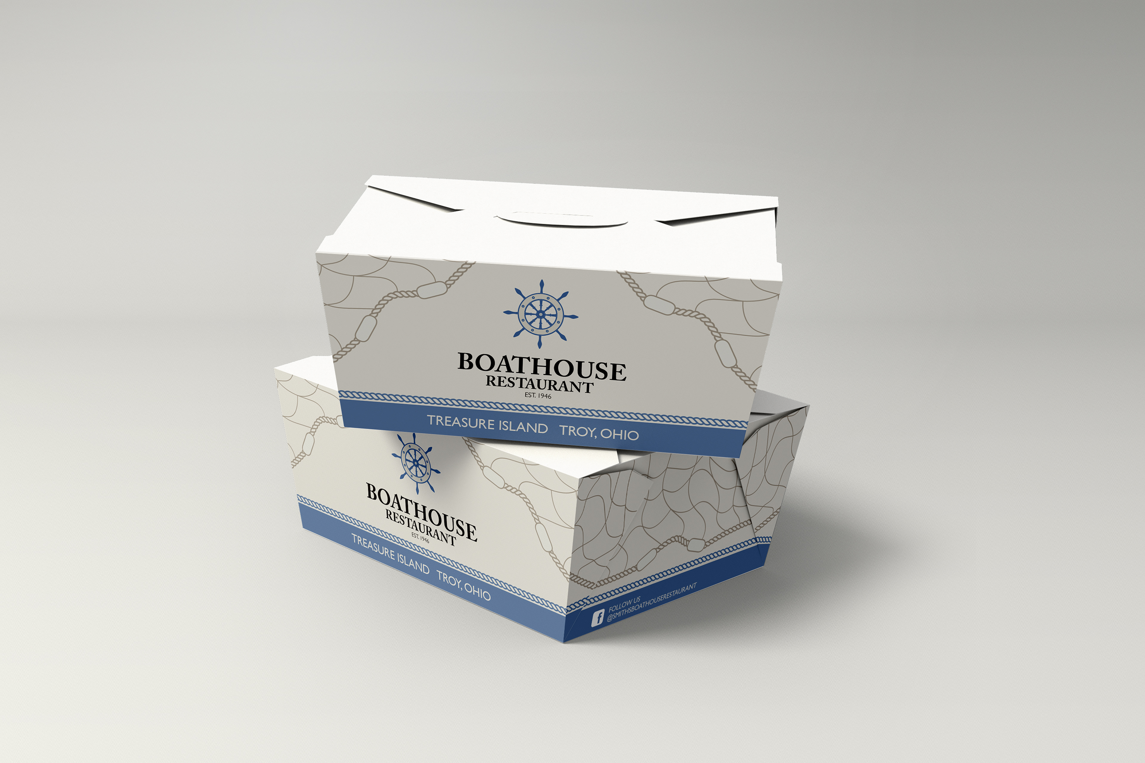
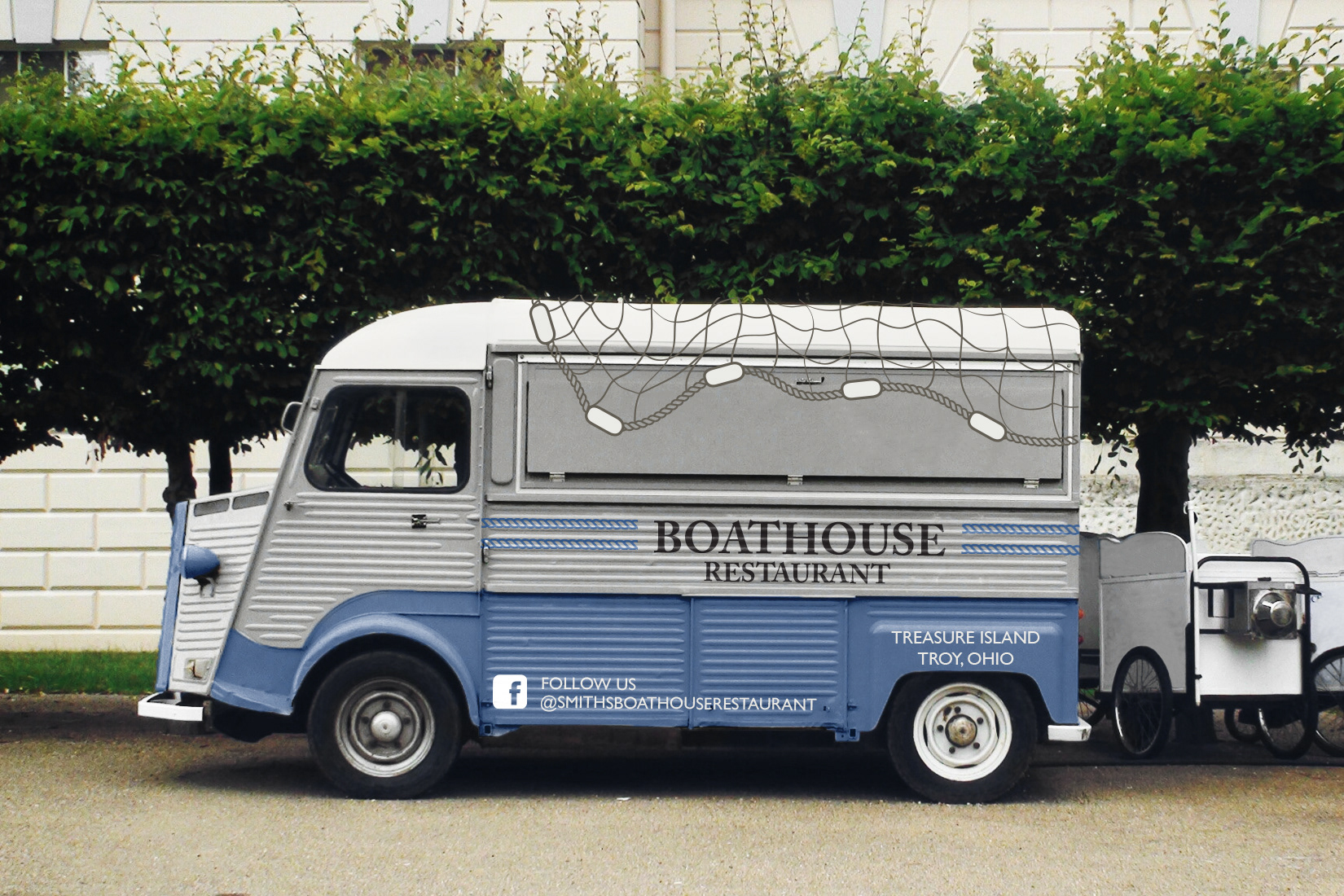
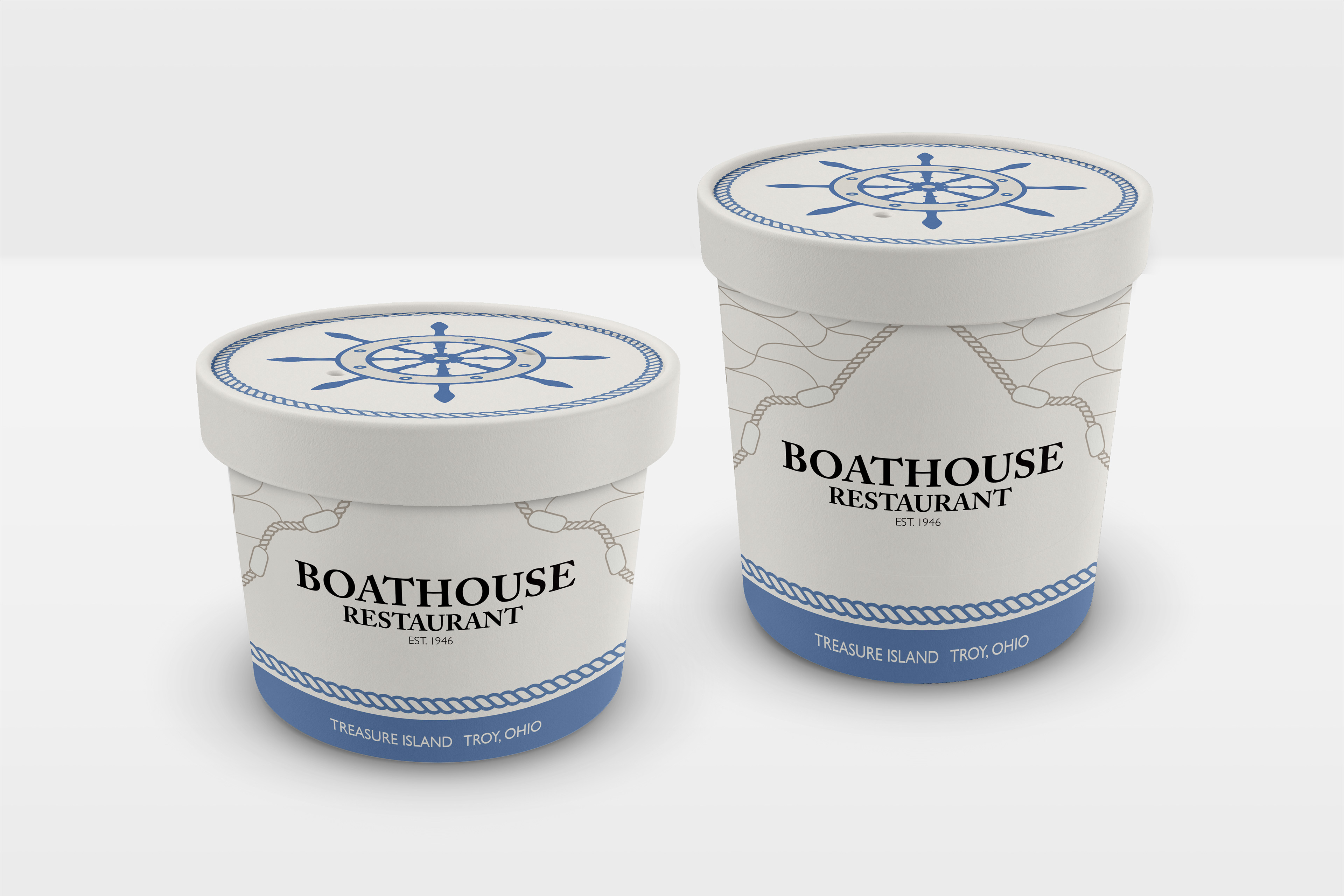
This project I developed a concept for carry-out food packaging for a restaurant near the town i grew up. I chose to keep a similar aesthetic to their current identity but changing it to make it my own. For their identity I designed my own version of their logo. I chose a serif typeface as the primary and a san serif for secondary information. For the color palette I applied muted blue and sandy brown colors to keep a coastal feel. In the Imagery I made the captains wheel to be used as a recognizable icon to be associated with the business. I wanted to give the packaging an illustrative element with the fishing nets draped from the top and wrapping around the sides.
I designed the illustrations, patterning, and branding within Illustrator and mockups in Photoshop
.
Check out this project on Packaging of the World!


