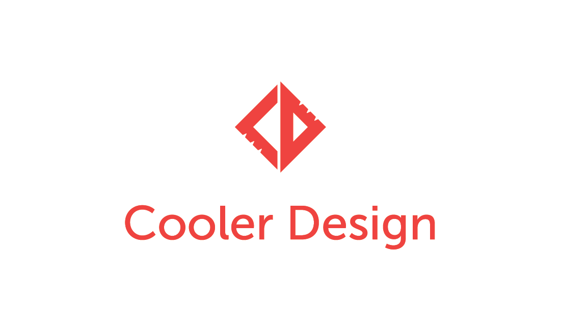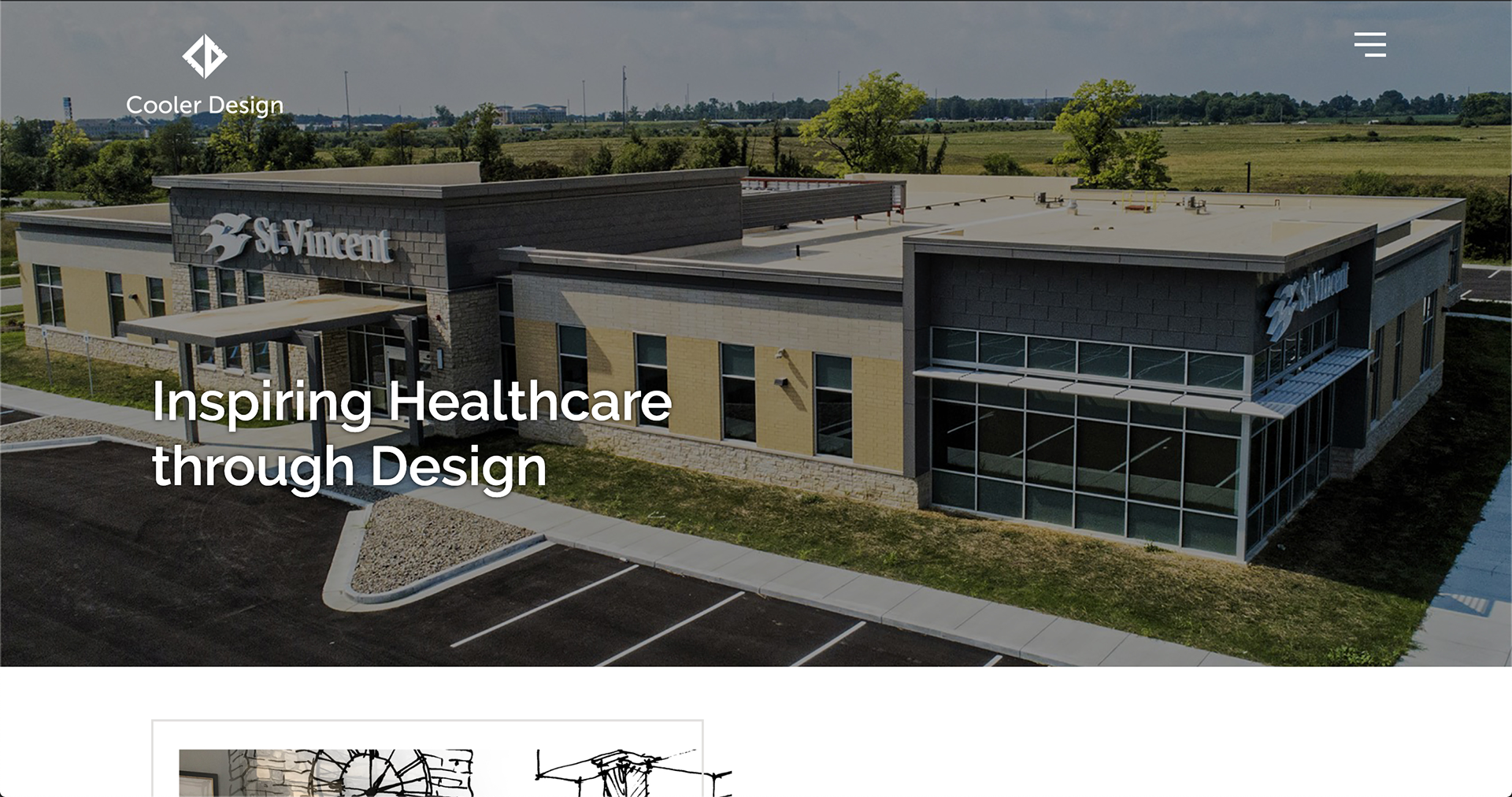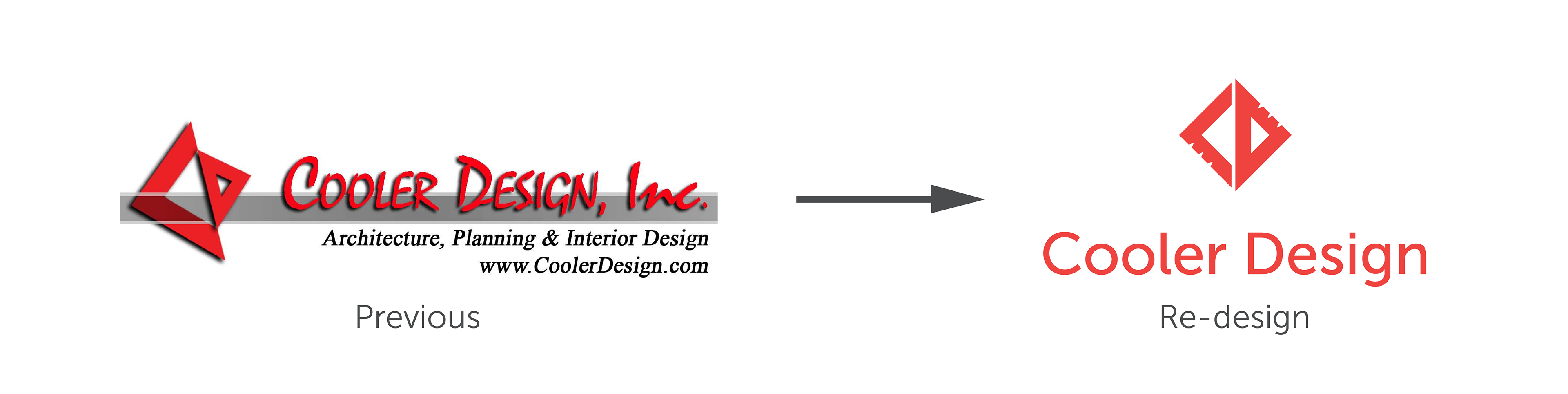
Logo & Brand Redesign
brand design
logo design
scroll to see more
\/
One of the larger projects I was tasked with while being an intern at Raygun Workshop, along with the help of the Principle of the company. The design agency was looking to bring in the owner of an architecture firm in efforts to convince them that they needed to refresh their look. When choosing a typeface I wanted to find one that had more structure and geometric shape but still retaining a modern look. The logo-mark illustration functions as both the letters C & D for Cooler Design as well as architecture tools. I updated their logo-mark by making it more flat and symmetrical while giving it structured position above the name. I also added the notch marks that suggest more on the architecture tool imagery.