
Logo & Brand Redesign
branding design
brand guidelines
logo design
motion graphic
scroll to see more
\/
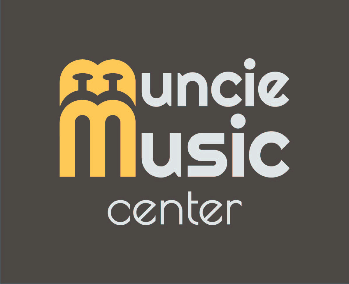
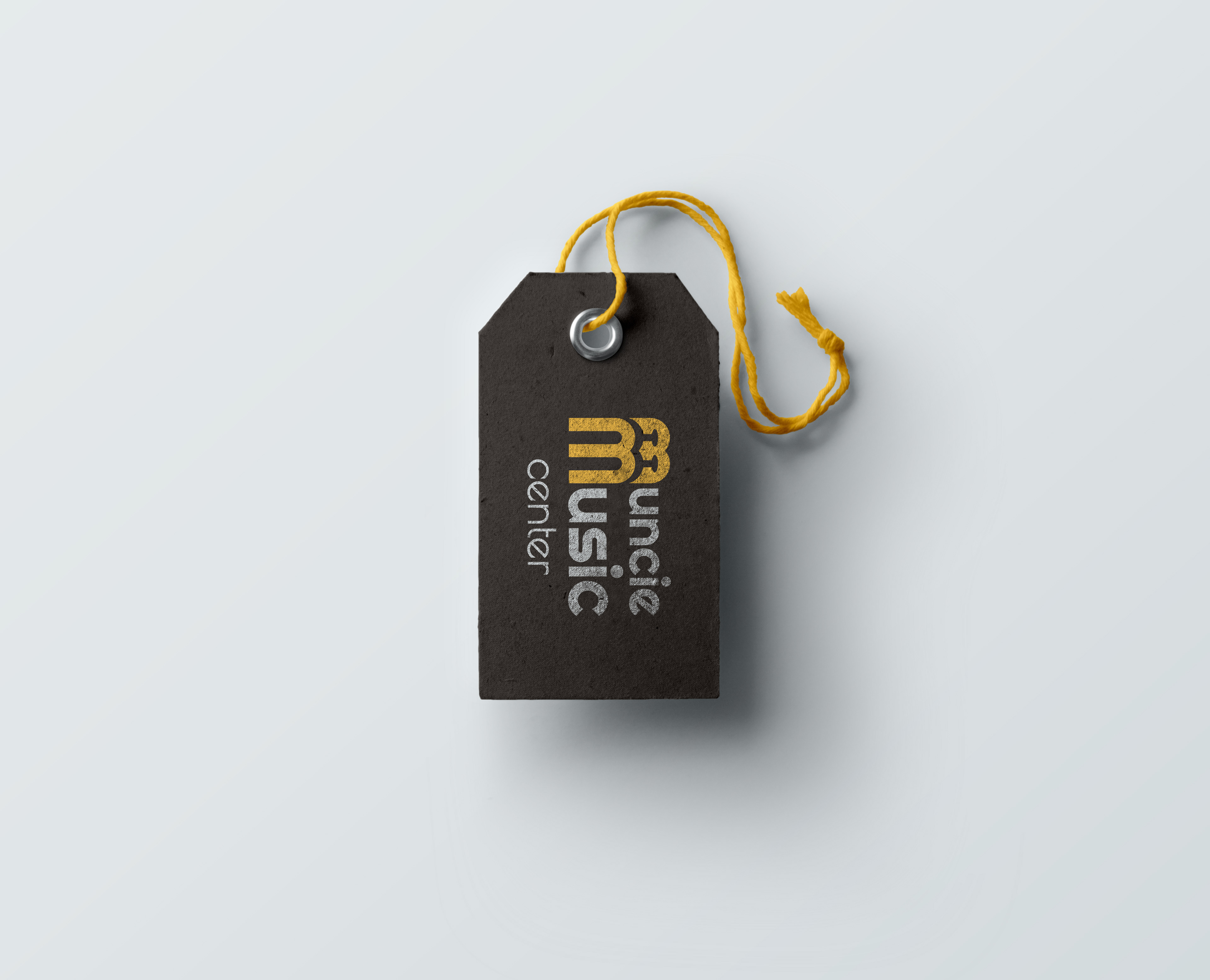
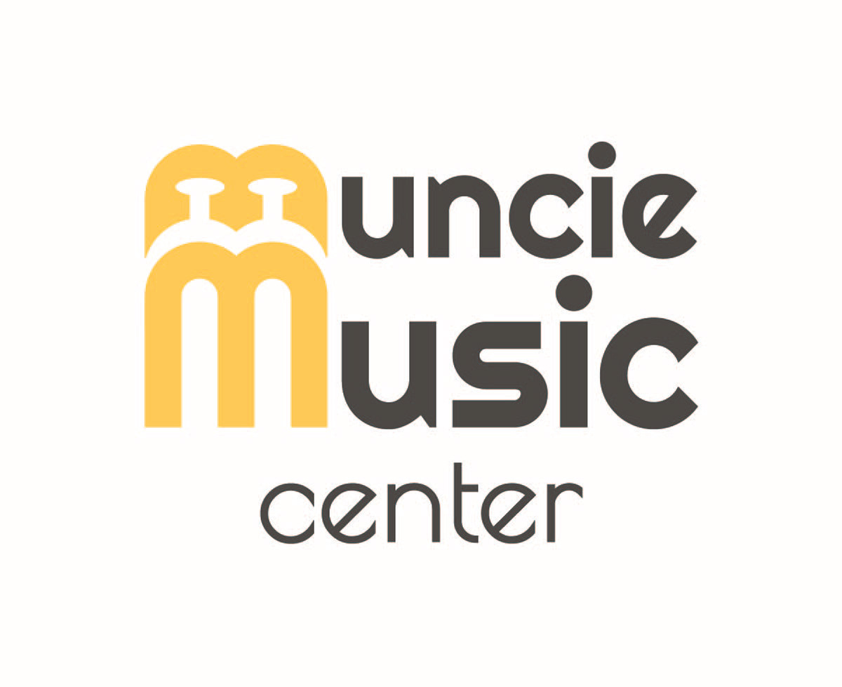
For this project I choose a local business in Muncie, IN that I felt could use a new logo and Identity system. When meeting with the owner, we came to the conclusion that his target audience are students that rent instruments. For the color palette, I wanted a classic feel but adding a more modern bright color, using the warmer black, off-white, and brassy yellow. When designing a logo, i wanted to incorporate the idea of instruments but in a subtle way. The type-mark of the two “M” letters would be an iconic visual, using a brassy yellow with the negative spaces of the top letter, forming instrument valves. I also wanted the type to resemble instrument tubing from the roundness of the curves.
I designed the illustrations and branding within Illustrator.